Email Marketing
What makes a good subject line?
Subject lines are an important part of your email, so here's how to not mess them up.
Read More →
Here are 5 creative email campaigns that stood out in our inboxes this month.
Every month we pull a list together of marketing campaigns which stood out to us. This month we decided to focus on great campaigns we have seen in our inbox - here's a few.
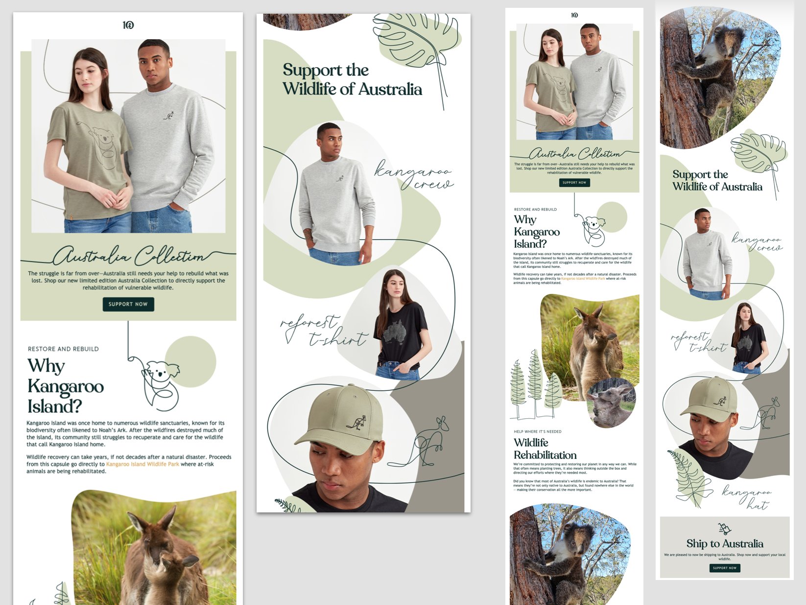
Firstly, who doesn't love a little koala greeting your inbox? This email convinces with a beautiful design and a great message - rebuilding and rehabilitating wildlife in Australia.
The talented designers at Tentree combine photography, illustrations, and organic shapes in a beautiful way, creating a design that guides the eye down the email and feels fluid rather than blocky. The illustrations used in the email match the designs in the clothes which joins everything together perfectly. A really well-thought-out email which looks great in the inbox!
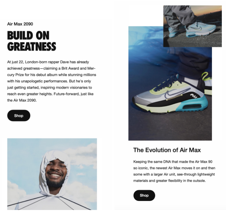
What I love about this email is that it's not directly selling you the new collection, but it's telling a story about Nike's collaboration and Dave. They mention Dave is "inspiring modern visionaries to reach even greater heights. Future-forward, just like the Air Max 2090."
The style of the email is more of an editorial layout, something to be expected from a fashion brand but is really easy to read through. Limited text, with simple CTAs makes a great read and it's very tempting to click in and view the full range!
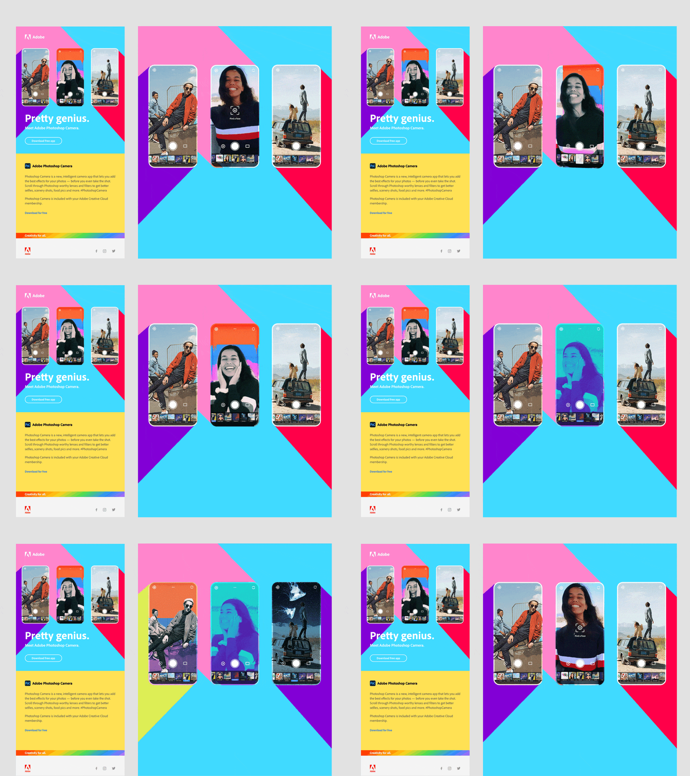
See the animation in action here.
This email really shows how brands like Adobe stand out in the inbox! The bright colours and background animations make it different - which is what we want to see! And using a GIF to show off the product from taking a photo to the editing process is really clever. Overall it makes you curious about the product and you want to click in to download.
Take a look at the full email here.
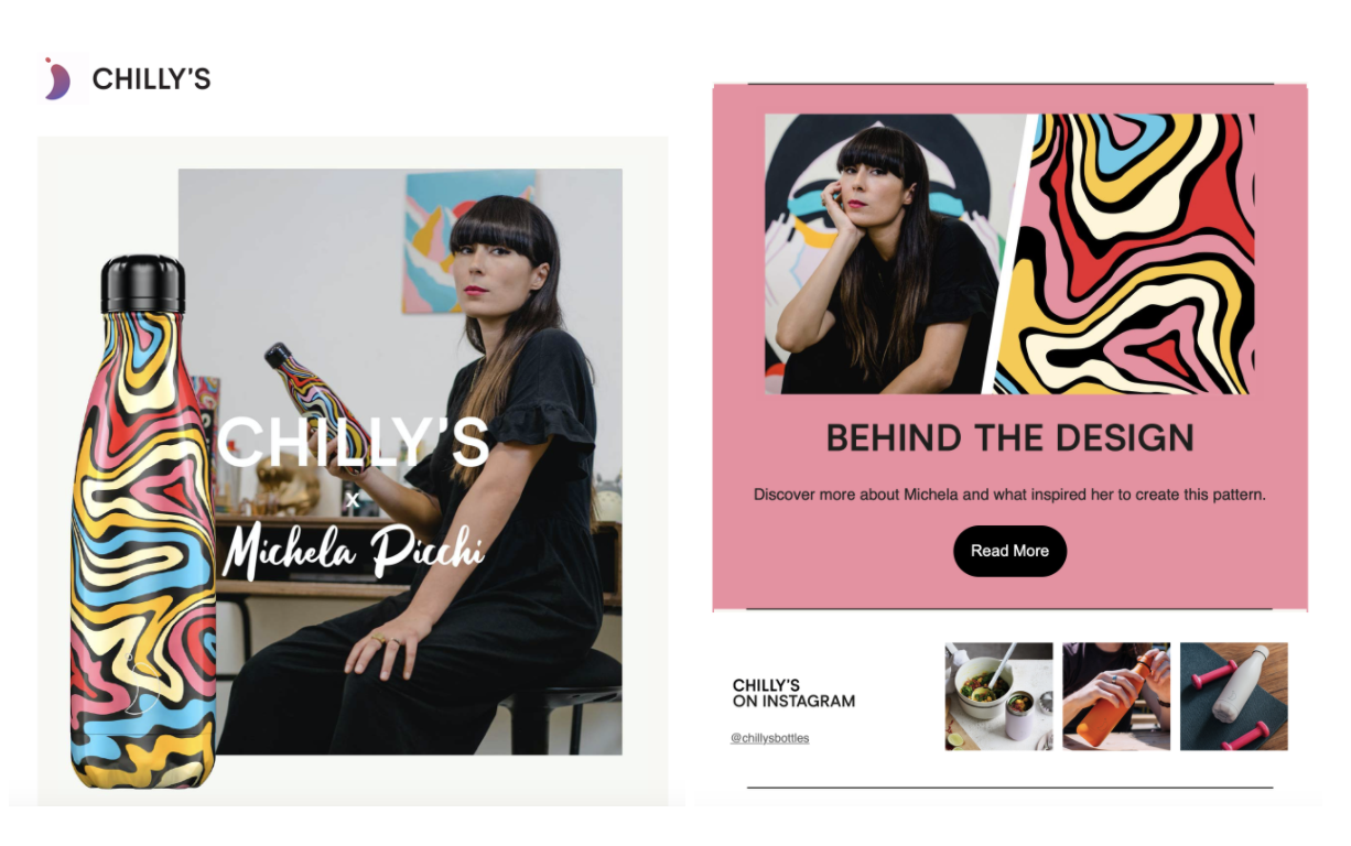
Chilly's is a really cool ethical brand, I love their fun and creative spin on creating reusable water bottles - I have definitely bought a lot from them and have noticed previously collaborations with brands such as Emma Bridgewater as well as designing a sea life range with 10% of profits going to City for Sea - a not-for-profit organisation.
The email has features of the product throughout and is really well laid out; I love the flow of the pink from the bottle being added to the background colour to merge it all together. Its a minimalistic style, with more of a story telling message as opposed to direct selling with soft CTAs to read more and shop now. The simple instagram promotion at the bottom is also a nice touch and links in well with the email design.
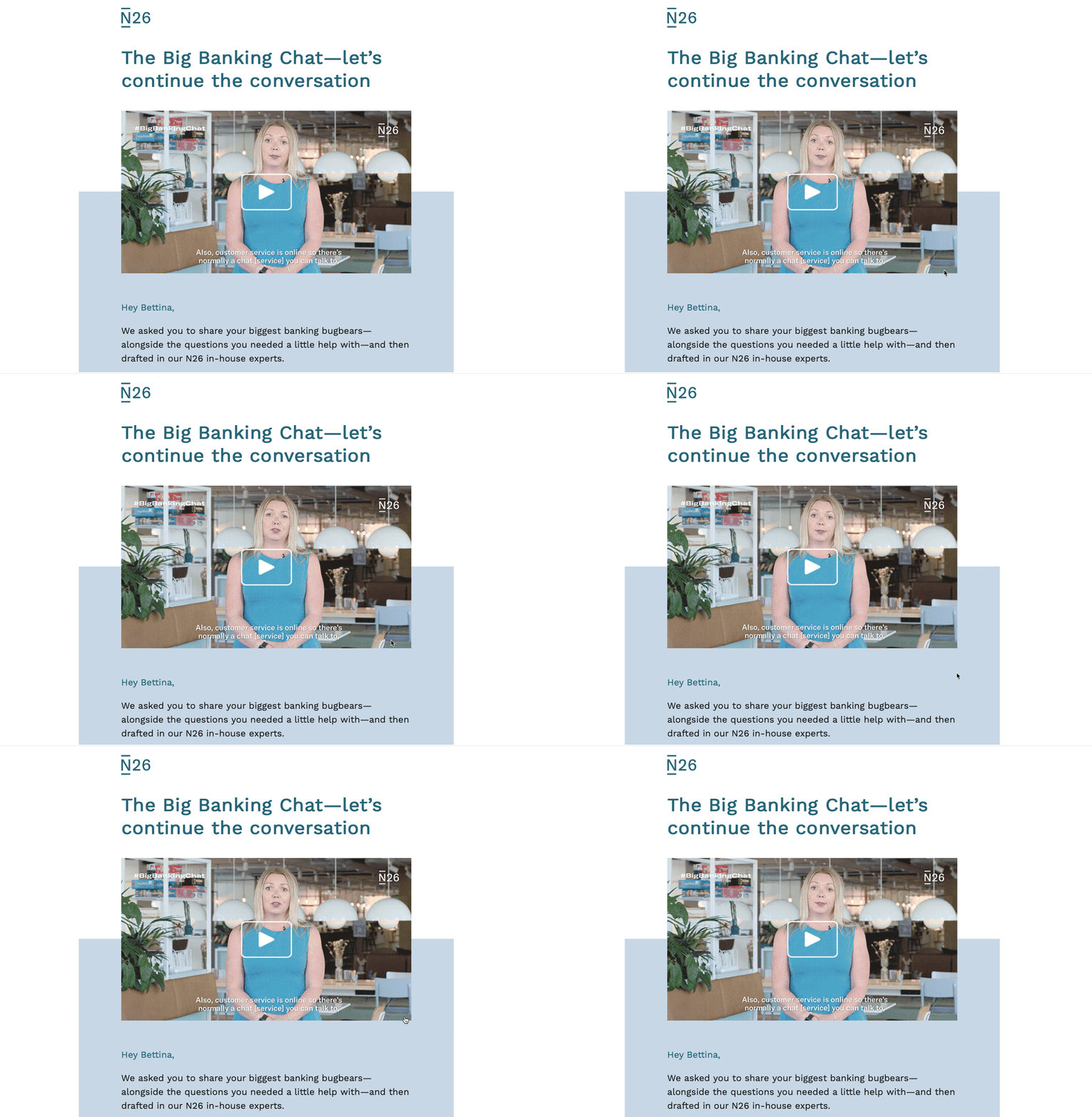
For anyone unfamiliar with N26, they are a mobile bank based in Germany. For me they have nailed the balance of creating informative and text heavy emails in a readable and easy to navigate format.
There's a few things which really stand out in this email:
That's all for now, but let's continue spreading the marketing, and general, love! Did you see any email campaigns in your inbox that you loved? Share them with us on Twitter!
Taxi helps marketing teams make better quality email, quicker, at a larger scale.