Taxi Syntax empowers marketing teams to make emails more efficiently than ever. Remove time consuming and repetitive tasks from your creation process to achieve this.
An effective Email Design System will make creating emails in Taxi as simple as possible. Thinking about ways that you can achieve this simplicity can help your teams get the most out of Taxi.
A good place to start is looking at your existing emails and speaking with your team to find out what tasks are most repetitive during the creation of emails. For example, do your emails always have the same background colour throughout and does it take a long time to go through each part of every email to change this? Use your Design System as an opportunity to address some of these manual steps of your process.
In Taxi you can have one field apply to multiple parts of your email or even all of your modules. Setting the background colour once and having it apply to all of your modules instead of doing it individually across every module is a good example of this. It can also be done with any part of your emails that you want to edit, such as text colour, font size or alignment.
It's also helpful to look at your existing emails and see if there are any combinations of styling or content that stay consistent across your campaigns. For example, when you have a certain background colour, do you always have a specific text colour, or when the title is a certain size, does this determine what font size the body copy is?
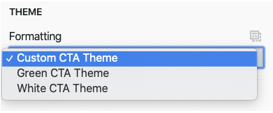
Taxi enables you to control multiple pieces of content or design with just one field. For example, you can make the background colour black, the text white and the CTA light grey without having to change them all individually. This will make it much easier to use your email design system, as repetitive tasks are removed which will save time and reduce room for error.

You can also use hints with your fields to help make it easier to use your Design System. Hints appear just under the name of the field in the editor and can offer a description of what that field is used for, or some guidance about how to use it. For example you could add an explanation that a dropdown controls more than one part of the email or give recommendations that a text field shouldn't contain more than a certain number of characters.

Your Email Design System will be the centre of your email creation so thinking about ways to make it as easy as possible to use, can make your team's creation process more efficient.