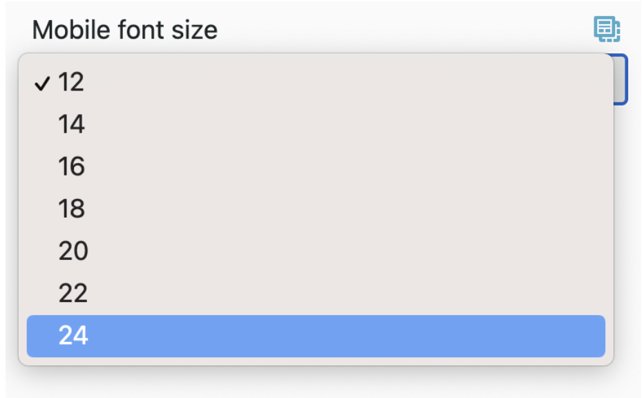
Taxi Syntax enables you to make any part of your HTML editable, including font size. If you need to have different font sizes on mobile, using Taxi Syntax means you can control this too.
Mobile font size is controlled through media queries and classes, and using these classes where needed throughout your HTML.
First, include a class for each option of mobile font size you want to include in your emails.
<style type="text/css">
@media screen and (max-width: 639px) {
.fontsize14 {
 font-size: 14px!important;
 line-height: 20px!important }
.fontsize16 {
 font-size: 16px!important;
 line-height: 22px!important }
.fontsize18 {
 font-size: 18px!important;
 line-height: 24px!important }
.fontsize20 {
 font-size: 20px!important;
 line-height: 26px!important }
.fontsize22 {
 font-size: 22px!important;
 line-height: 28px!important }
.fontsize24 {
 font-size: 24px!important;
 line-height: 30px!important } }
</style>
Then throughout your template you can use classes to control which bits of text you want to change on mobile. For example, if you wanted to have text as 16px on mobile:
<td class="fontsize16">
Body Copy
</td>
At the moment, this is a static value so the text inside this <td> will always be 16px on mobile.
At the moment, this is a static value so the text inside this <td> will always be 16px on mobile. To make it editable in Taxi, first you will need to add a dropdown field with all the mobile font-size options you want. The values of these will need to match the font sizes you have defined in your media query.
<field type="dropdown" name="mob_font_size" label="Mobile font size" default="16">
<choice label="14" value="14"></choice>
<choice label="16" value="16"></choice>
<choice label="18" value="18"></choice>
<choice label="20" value="20"></choice>
<choice label="22" value="22"></choice>
<choice label="24" value="24"></choice>
</field>
Once you have this dropdown field you can reference it in all the tags where you want to control the mobile font-size. You'll need to make sure you use the replace-class attribute because you're using the liquid variable {{mob_font_size}}.
<td replace-class="fontsize{{mob_font_size}}">
Body Copy
 </td>
Whatever option you choose in the dropdown will get used in the replace-class attribute, and this will control the mobile font-size. For example, if you select 24 in the dropdown field, the code will be class= fontsize24 .

This is why the classes in the media query need to match the values in the dropdown. The number you select in the dropdown gets pulled into the replace-class attribute, and becomes a valid class linked to the mobile font sizes you have set in your media query.
Next: Image Widths on Mobile